

Chester Romans American Football Team
January 2021
ongoing
The Chester Romans required a refresh of tired, old branding and graphics for use on social media to attract players, coaches and sponsors. This is a long-term, ongoing and constantly evolving project so pieces below date across several years.
Project Type
Branding, marketing and ongoing development
Contributors
Block 8 Media (photography)
Simon Joseph Photography
The Chester Romans are the oldest competitive American Football team in the UK and, as American football is a great passion of mine, I was eager to get involved. The committee were keen to utilise social media to attract more players, experienced coaches and more sponsors to the club, emphasising their vision of ensuring the sport is accessible for all ages 13+ in Cheshire and North Wales.
Immediately it was clear that some new photography was required, so I enlisted the help of my friends at Block 8 Media to snap some of the Romans both in action and in a photoshoot for use in graphics.
The research for the Romans is constantly ongoing as is the project itself.
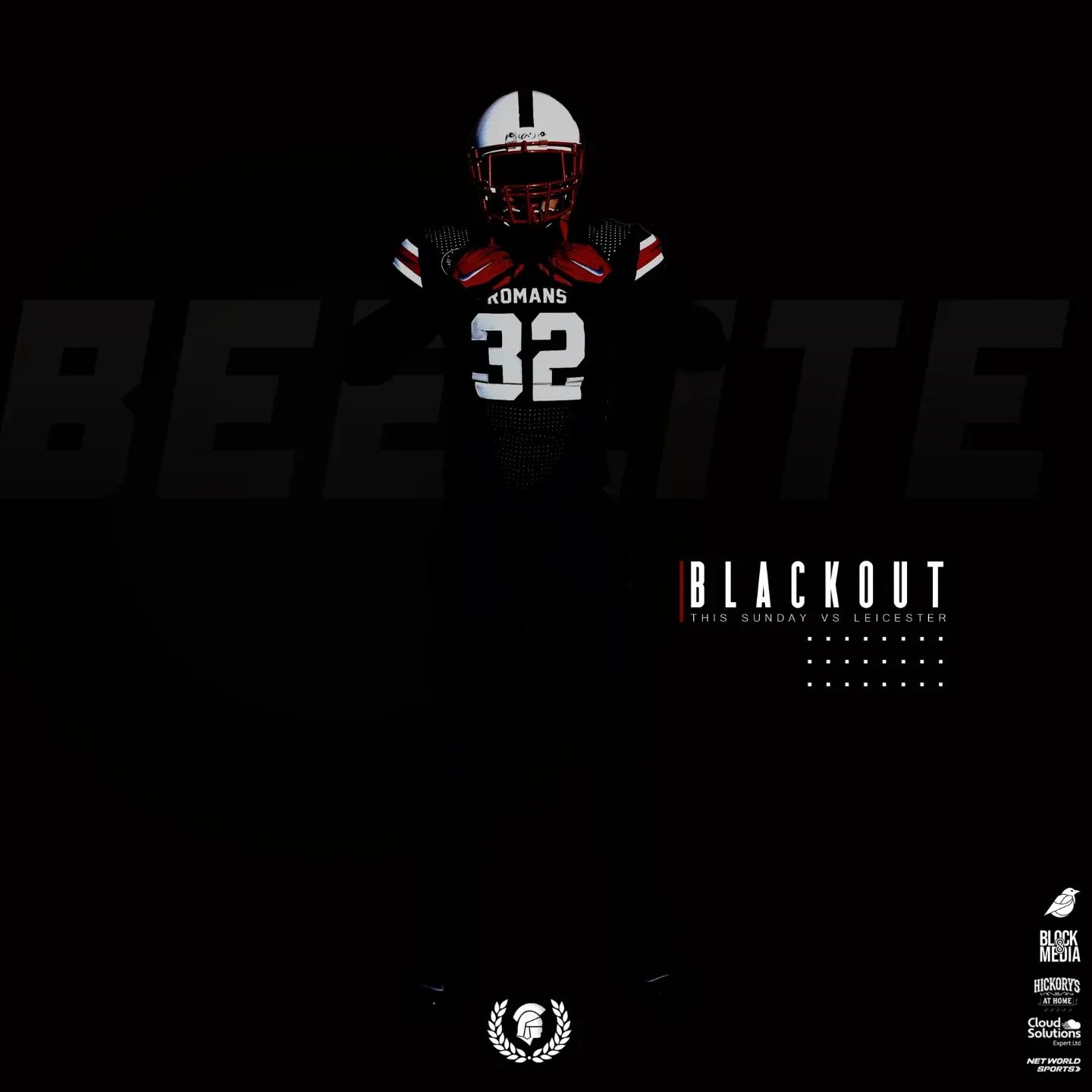
Colour scheme – the initial feeling is that the red colour used by the Romans was too garish and bright for social media. I researched red colouring used by the Roman army on the shields and uniforms and, whilst they tried to use bright red to symbolise blood and strength, they used a dye called Kermes, made from beetles, and it would often result in a more crimson red. This resulted in the #A90403 colour that has been used since inception in January 2021, alongside black and white.
Font Choice – The fonts have changed throughout this project, for good reason. Initially a strong, bold font was required alongside a more traditional sans-serif font for blocks of information. Bebas Neue was chosen as the bold font, with the close kerning and strong, bold appearance symbolising the front line of a Roman maniples formation with their scutum (shields), whilst also communicating the message clearly to the user. Lato was selected as a traditional sans-serif font.
More recently I have moved to the Freedom Forever font to replace Bebas Neue. Under further analysis, Bebas Neue could prove difficult to read quickly due to the bold nature and close kerning, with letters merging into one another for various conditions such as dyslexia. Freedom Forever also has an outline only variant that has come in very useful in various graphics.


Talk to us.
Like what you see? Have some ideas? Or no clue at all but want to get going on your next project? We have your answers. Contact us.